Paint Colors Used in My 100 Year Old Tudor
Choosing a paint color is one of the most impactful, and surprisingly challenging, steps in making a house truly feel like home. The right color sets the tone the moment you walk into a space, shaping how it feels, flows, and functions. Below, I’m sharing my favorite paint colors that I’ve used throughout my own home, along with visual examples to help you see them in action.
Many of these shades have also been used in other projects over the years, and time and again they’ve proven to be beautiful, versatile, and timeless choices.
Simply White
Benjamin Moore
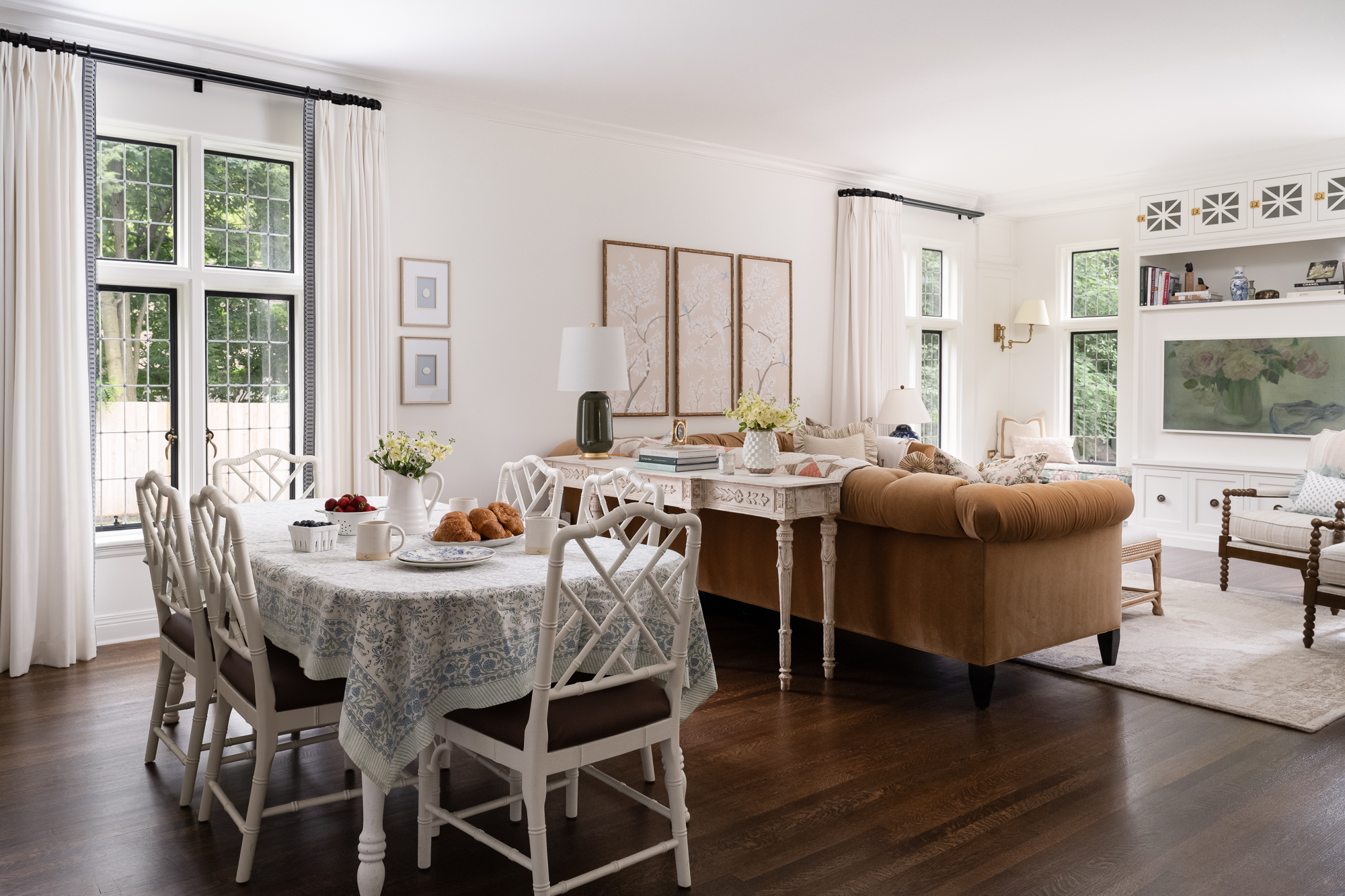
Benjamin Moore Simply White is the color we used on our cabinetry and. most of the walls and trim throughout the house. It’s the perfect balance of warm, yet light and bright. It coordinates perfectly with the warm color of the unlacquered brass accents throughout the home, yet at the same time is the perfect pairing with the cool carrara marble countertops. Something to note is that you cannot color match this paint color, it will have a yellow hue to it and won’t look the same as the real Benjamin Moore Simply White.


Manchester Tan
Benjamin Moore
Manchester Tan from Benjamin Moore is the trim color I used in the girls’ bedrooms. It adds a touch of warmth and coziness that is perfect for a bedroom.

Teresa’s Green
Farrow & Ball
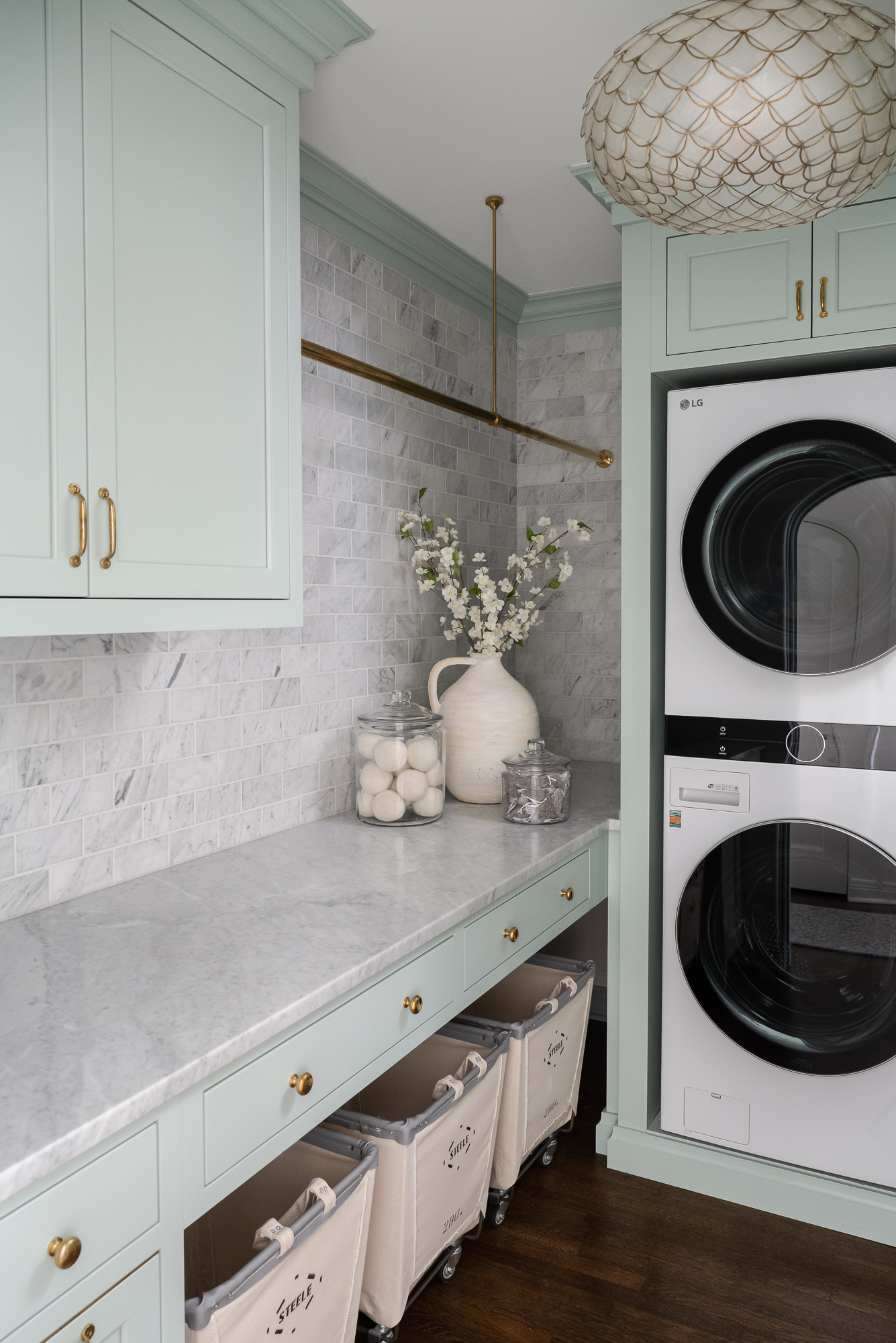
The trim and cabinetry in my laundry room are painted Teresa’s Green by Farrow & Ball. The color makes me feel so happy every time I see it (despite being in the laundry room!). It’s cheerful yet calming.
Stiffkey Blue
Farrow & Ball
Brian wanted moody cabinetry somewhere in the house, so I selected Stiffkey Blue from Farrow & Ball for our wet bar. It’s dark and moody, but blends in seamlessly with the rest of the home (which is a bit more light and bright).

Parma Gray (25%)
Farrow & Ball
Parma Gray has been on my wishlist of colors for quite some time. I just love this paint color! The color can be a bit intense, so I found that only using the color at 25% was perfect on pocket doors in our kitchen and built-in cabinetry in our living room.

Black Iron
Benjamin Moore
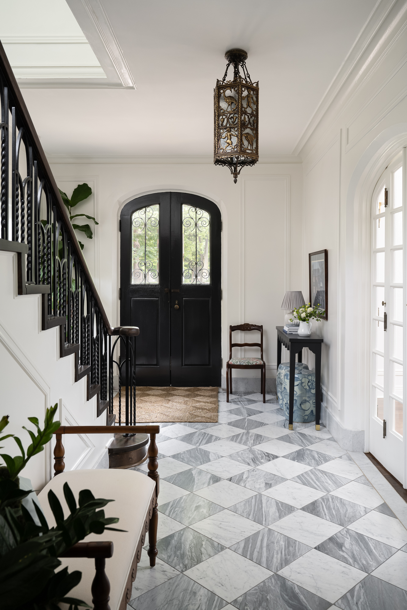
The interior side of our front door is painted Black Iron by Benjamin Moore. The dark black door contrasts perfectly with the simply white walls while coordinating with the original stair railing and light fixture.
Frosty Pink
Benjamin Moore
My girls love pink and all things girly, so I incorporated pink trim into their playroom. Frosty Pink by Benjamin Moore is light, creamy and doesn’t have blue undertones as I found many other pinks to have when searching for the perfect pink paint color.

Related Posts
Based on this post, here are a few similar ones you should check out.
Leave a comment